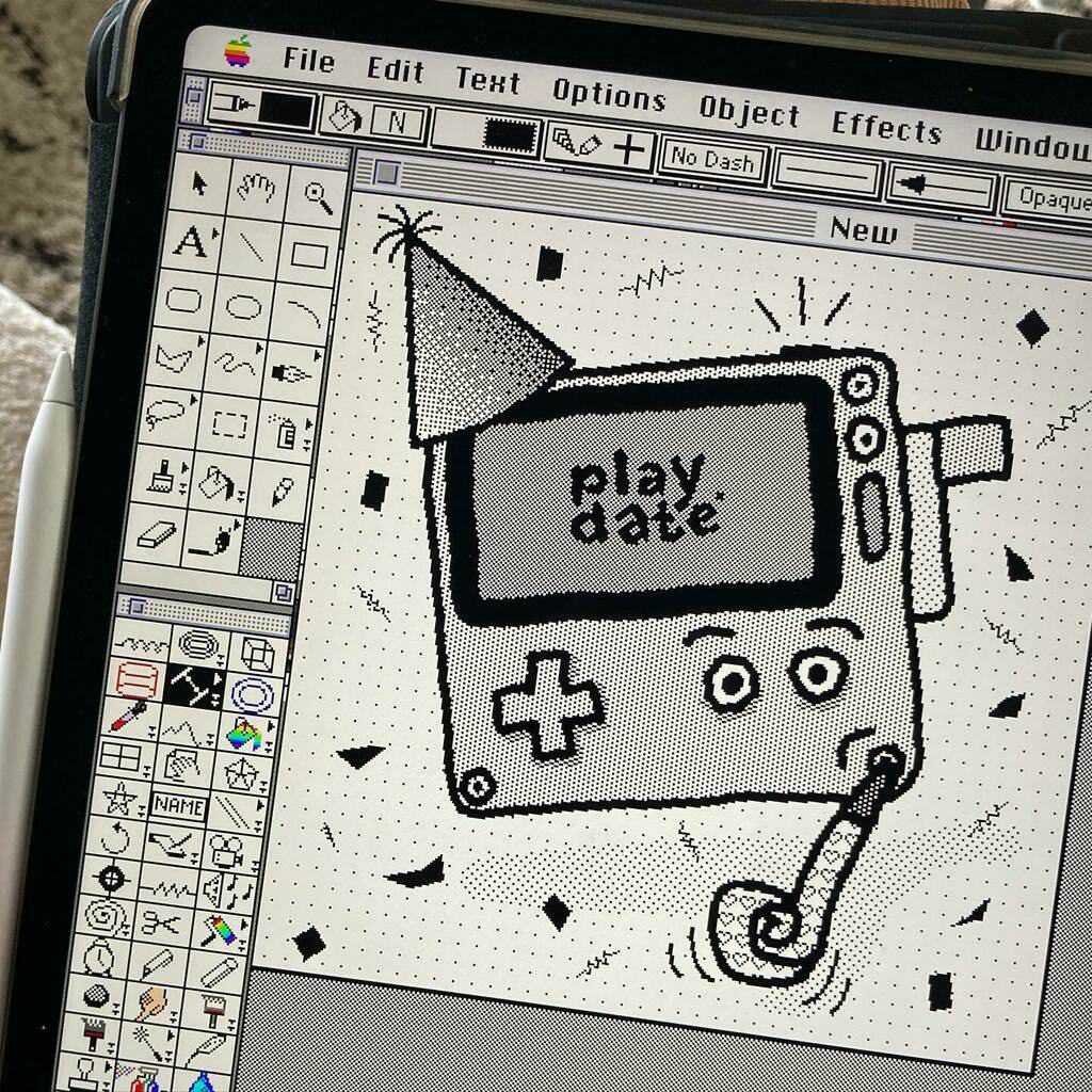
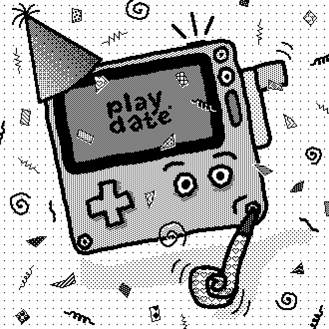
Yesterday saw the opening of pre-orders for Playdate, a new handheld gaming device that I’m developing some games for. To celebrate the occasion I drew an illustration in 1-bit with dither patterns using Macintosh System 7.
This kind of style is most associated with HyperCard, which provides a bunch of great drawing tools and modes, and can be seen in many period pieces of interactive media, animations, art and video games.
I’ve been revisiting the artwork of Thoru Yamamoto recently, which I think influenced the style of this piece.
Toolbox
My tool of choice on System 7 is Deneba artWORKS because it supports multiple layers, a ton of external tools (plugins), and has a good workflow for vector and pixels. Plus, I use it on iPad Pro with Apple Pencil which makes the whole experience an absolute pleasure.
Some established Macintosh artists have questioned both my use of modern technology and my drawing techniques. Hopefully this post will give a little more insight into how I go about things.

Playdate
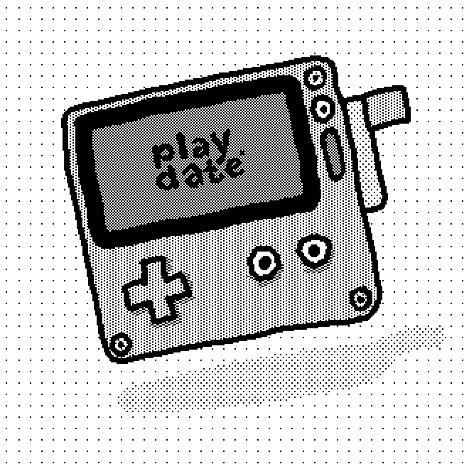
I first drew the body of the Playdate using Rounded Rectangles for the perimeter, screen, crank, d-pad, speaker grille and using Ovals for the buttons and corner screws. This was all done by eye, no measuring.
Afterwards I grouped all those shapes and used the Point Rotate external tool to rotate the group by an arbitrary amount until it looked like a fun enough jaunty angle.
Next, in the Layers Manager I set the shape layer to be greyed out and created a new layer to do some drawing. I used the Paintbrush tool with small circular brush to draw over the shapes by hand, erasing any mistakes and redrawing some sections of lines until I was happy.
Colouring
Given the nature of 1-bit there is no concept of colours only patterns of black and white to simulate different shades of grey. I could have drawn in colour and had the system convert to dither patterns, but I want to have manual control over the shades.
I first picked the dither pattern for the main “yellow” body and then picked the paler, more sparse, dither patterns for the steel crank handle, drop shadows and background. Fills were applied to closed areas using the Paint Can (flood fill) tool.
Details
I used the Paintbrush and Pencil tools to add in some details like the dots on the buttons and my hand-drawn version of the Playdate logo. The shadow was drawn freehand using the Paintbrush tool with a larger circular brush size. The background pattern is a simple sparse dither pattern applied using the Paint Can tool.

Party Up!
For pre-order day I thought it would be fun to add an extra layer to the illustration making it more celebratory. I had the idea to replicate the 🥳 emoji (Face with Party Horn and Party Hat) with the Playdate I’d already drawn.
Horn
This was drawn using a combination of freehand Brush tool and filled vector Polygons. Some extra shading is done using the Brush tool and a sparse dither pattern. I must have drawn a handful of different style horns, settling on the one that looked least like Playdate was smoking!
Hat
This was drawn as a vector path using the Polygon tool, and filled with a dithered pattern using the Gradient Fill tool. The frilly stuff on top of the hat is a handful of Arcs drawn in various directions, always starting from the tip.
Confetti
For the confetti I didn’t want to draw each one by hand, and I wanted them to be vectors rather than pixels so they remained as editable as possible. I found that drawing very short curved strokes using the Pressure Pen tool produced shapes that looked a lot like tiny squares of paper bent at some 3D angle. Using this tool without any pressure means it performs as a dynamic, vector calligraphic pen. A nice little trick!
Afterwards I applied one of the many standard fill patterns to each piece of confetti to give them a bit of individual flavour. Any confetti overlaying the Playdate body was duplicated, made white, and offset by a pixel or two to help make it stand out from the body. You can see this most clearly on the coil shape at the right side of the Playdate screen.
Jazz
The extra geometric shapes in amongst the confetti are my attempt at bringing a bit of 1980s Memphis Group design aesthetic to the illustration. I use a variety of different external tools for this: Spiral (length 2), Fractals (default wiggle and density), Coil and Resistor. The later two tools are meant for drawing electrical circuits! The moral of the story: know your tools and use them!
Positioning
After adding all the confetti and jazz, I adjusted the positions and sizes of many of the objects to produce what I thought was the most pleasing distribution. The benefits of all of these objects being vectors becomes clear at this point!
Motion
I used the Arc tool to add motion lines to the party horn and crank. Lastly I added some straight lines to imply that the light on the power button is flashing.
Pixel or Vector?
Looking at the objects that make up the drawing, I’d say that the split is around 75% vector to 25% pixel, which is the same across most of my drawings.
Pixels make up large freeform areas, filled vector shapes make up large defined areas. Small objects that will remain static use pixels, and those that I think will need to be moved or resized use vectors.
I tend to draw on the base layer with pixels and then use higher layers as rough groups for sets of vector shapes. For example, the confetti was all drawn on one layer.
Post-processing
I saved out the image as a GIF (another external tool provides this capability) and loaded it into DeBabelizer, or sometimes Photoshop 3.0. Here I resized using simple sampling to 990px square from the original size of 330px square.
Finally, I copied the file to BasiliskII emulator File Sharing drive at which point it became accessible in Files in iPadOS, and from here I sent it to my iPhone via AirDrop, after which I used the Twitter app to add the image to a tweet and hit send!
Job done.

Keyboard craving
I drew this late at night and was too lazy to go and find my Bluetooth keyboard. Next time I’ll definitely make the effort to find it. That way I can use my spare hand do keyboard shortcuts and to nudge positions using the cursor keys. I should really add cursor keys to the emulator’s custom keyboard.
Let me know your thoughts on Twitter using the comments link below.
Your support through ko.fi keeps this blog brewing!
--
Comments: @gingerbeardman