With the news that Apple are courting TV programmers with the idea of an all-encompassing TV Guide, I thought it would be fun to recap my personal history of TV Guide usage and think about where it might be going next.
Disclaimer: whilst I am a former Apple employee, I know of less than nothing about any current or future plans for iOS or tvOS.
I get my kicks on Channel 6
For a long time in the UK—during the pre-internet era, when computers loaded their software from tape cassettes and floppy disks—the Great British public turned to their Televisions for more than just TV shows. We had teletext information services which were kind of like having a limited but nonetheless powerful intranet built into your TV.
The BBC had what they called Ceefax (cf. “See facts”) whilst their main competitor ITV had Oracle, which was eventually replaced by a service called Teletext (with a capital T) run by Teletext Limited that went on to become a hugely popular service that dwarfed even the BBC’s offering.
All of these teletext services provided general information, such as news, weather, recipes and reviews, stored in a carousel of hundreds of sequential pages. You might want to imagine the bbc.co.uk website shrunk down to several hundred pages, each containing no more than about one hundred words. These pages would be transmitted with the broadcast picture and refreshed in a repeating cycle. Your TV’s inbuilt decoder would look at a few lines of the broadcast image and convert the data into screens of ANSI-like coloured characters that form pages of text and blocky graphics. You’d select your desired page by punching in a three digit page number on your remote control and waiting for it to come round in the carousel.
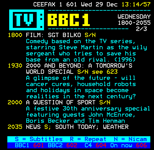
All the teletext services I used provided a TV Guide. This was an EPG before the acronym had even been coined. Roughly equivalent to popular printed TV guides of the time they presented succinct information about the day’s programmes over several pages. Here’s a screenshot of a TV listing from BBC’s Ceefax:

Additionally, a Now & Next feature could be overlaid on top of the TV picture, occupying the bottom half of the screen, leaving the moving image visible in the top half. Close caption subtitles were done in the same way.
Digital Love
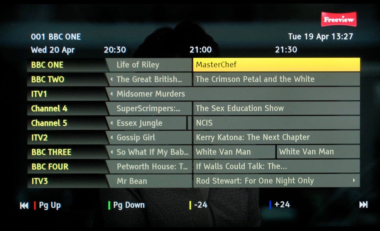
Even at the time of its introduction to the UK, the technology powering teletext was old, so it was inevitable that it would eventually be replaced. That happened with the switch off of analogue television and the switchover to digital terrestrial services that were eventually ratified into a standard known as Freeview (and, sometime later, Freeview HD).
The chunky pixel pages of teletext were replaced by slightly less pixelated screens of MHEG content which, despite it actually being a declarative programming language, could render images and data in a more freeform and structured way than the columns of characters teletext was limited to. The flip side of this brave new world was that the onus now fell on hardware manufacturers to implement the MHEG engine themselves, which resulted in a wide variety of compatibility issues similar to how things were with web browsers before WebKit.
Trying to find a decent Freeview box was a real challenge and I went through a whole host: from software built in to my TV, cheap supermarket own-brand boxes, through to a box made by Korean satellite TV specialists Topfield that had its own API and App ecosystem resulting in extensive user customisation. Eventually I discovered a strange looking box made in Wales by a small company named TVonics.
TVonics: the box that’s not a box
The guys at TVonics were clever enough to notice that a recently built Sony fabrication plant in southern Wales could produce their HD-capable boxes on home soil, and had partnered with then-fledgling London design company ustwo to create the user interface for their Freeview software. This was a master stroke and resulted in the most usable Freeview software I’d ever had the pleasure of using.

Even though this was only 5 years ago, it was still a time where the remote control was the long accepted method of input when watching TV. The user interface created by ustwo was simple but effective, form following function. The only real personalisation was the ability to change the colour scheme. The rest of the interface seemed very obvious, but therein lies great design: everything was where you expected it to be and every screen adhered to the same design principles. It had been thought about, and more importantly it had been executed well. Not just in terms of the design, but also in terms of the software that TVonics created. Every aspect of the Freeview HD spec was present, implemented to a higher standard than they had been described in the specifications. The interface was more performant than other boxes and the whole thing was a real joy to use. At this time TiVo may have had extra features, but TVonics version of Freeview was streets ahead in terms of user interface and experience.
Knowing Me, Knowing You
Today Freeview continues in one form or another. There are a small number of middleware providers that have made the MHEG headaches largely disappear. But Freeview now has a number of competitors, the most interesting of which—when it comes to TV Guides at least—is YouView. YouView is both the name of the platform and the partnership that own it.
The most interesting feature of YouView, as a platform, is the way it combines catch-up content with scheduled content in its EPG. This allows you to scroll backwards through the timeline to get to the tv shows you’ve missed. But it seems that making a longer timeline isn’t the solution to the problem of there being too much on TV.
Oranges and Apples
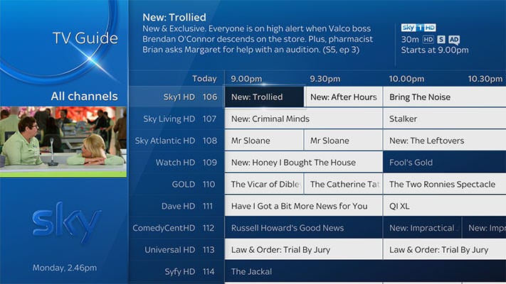
So what’s next? Apple seems to think that the days of scheduled content are over. They probably have a point. The rise of on-demand services from Netflix, Hulu, Amazon, HBO, BBC—and almost every other TV programmer—means that it’s no longer as simple as putting all available channels on a timeline. Sky TV has an interface that has been struggling under the weight of this problem for decades, and their latest Sky Q product doesn’t do much to ease the problem, let alone solve it.

Wishing on a Star
A better approach would be to make the TV guide more intelligent. Categorising all available content from all providers with the same taxonomy would help get things to a usable point. I don’t think the iTunes taxonomy would be enough here, but I’d imagine there are some clever people over in Cupertino working on a better one right now. If they haven’t already finished it.
My guess is that Apple’s intentions for a TV Guide can be summed up in one word: Siri.
Already present on the current Apple TV software, tvOS has added content providers to Siri’s knowledge at an increasing rate—as long as you live in the USA. The rest of us are stuck being able to search only iTunes and Netflix. Regardless, the Siri efforts in the USA could be seen as laying the groundwork for a unified TV Guide feature.
However, asking Siri to show you the latest episode of Stranger Things, a movie starring Peter Dinklage, or a movie featuring a VW Beetle, can only go so far. More often than not I find myself looking at my Apple TV home screen clutching the Siri remote—a thing of beautiful symmetry and dubious usability—with no idea what I should watch, and fearful that the brief window of time that I have will be over before it’s even begun. Why can’t Siri decide?

Suggestions similar to those provided by Netflix could be combined with the data gleaned from my Apple TV and iTunes usage, search history and past purchases. This isn’t an easy task, of course. Netflix have previously invested millions into refining their suggestions accuracy through their Netflix Prize, which ended in a law suit and some concerns from the FTC about privacy.
Interestingly Apple have already planted the seed of a solution to similar issues, with their introduction of differential privacy at WWDC 2016. I thought the introduction of this feature was somewhat vague, though perhaps this was by design. To recap, differential privacy is the statistical science of trying to learn as much as possible about a group while learning as little as possible about any individual in it. It’s also a way of describing the collection of huge amounts of personal data whilst still being able to refer to it as privacy. Handy, that!
If the rumours are true regarding the next generation Siri’s vastly improved ability to both interpret speech and form responses, then no better time to put it to the test than a feature that could very well turn the tables on yet another market.
Up to eleven
The timing of these rumours doesn’t seem like a coincidence to me. I think it’s a typical Eddy Cue play, throwing a tidbit of knowledge to his preferred news/media outlets and have them whip up a bit of a storm, one that will hopefully bring the TV execs around to his way of thinking. It’s not subtle, but I suppose if it has worked for him in the past he’s going to keep doing it.
Importantly, if a TV Guide feature is agreed soon it would allow just enough time for it to make the cut for inclusion into version 11 of iOS and tvOS. And there’s nothing like a deadline to get things moving.
